METROV
Designing an interior for a METRO hypermarket is a really big challenge.
A brand with an imposed standard German design, which does not go beyond the framework of the defined design model, suddenly decides to appear with a unique regional design, organizing a competition for this purpose. And we won it! ...
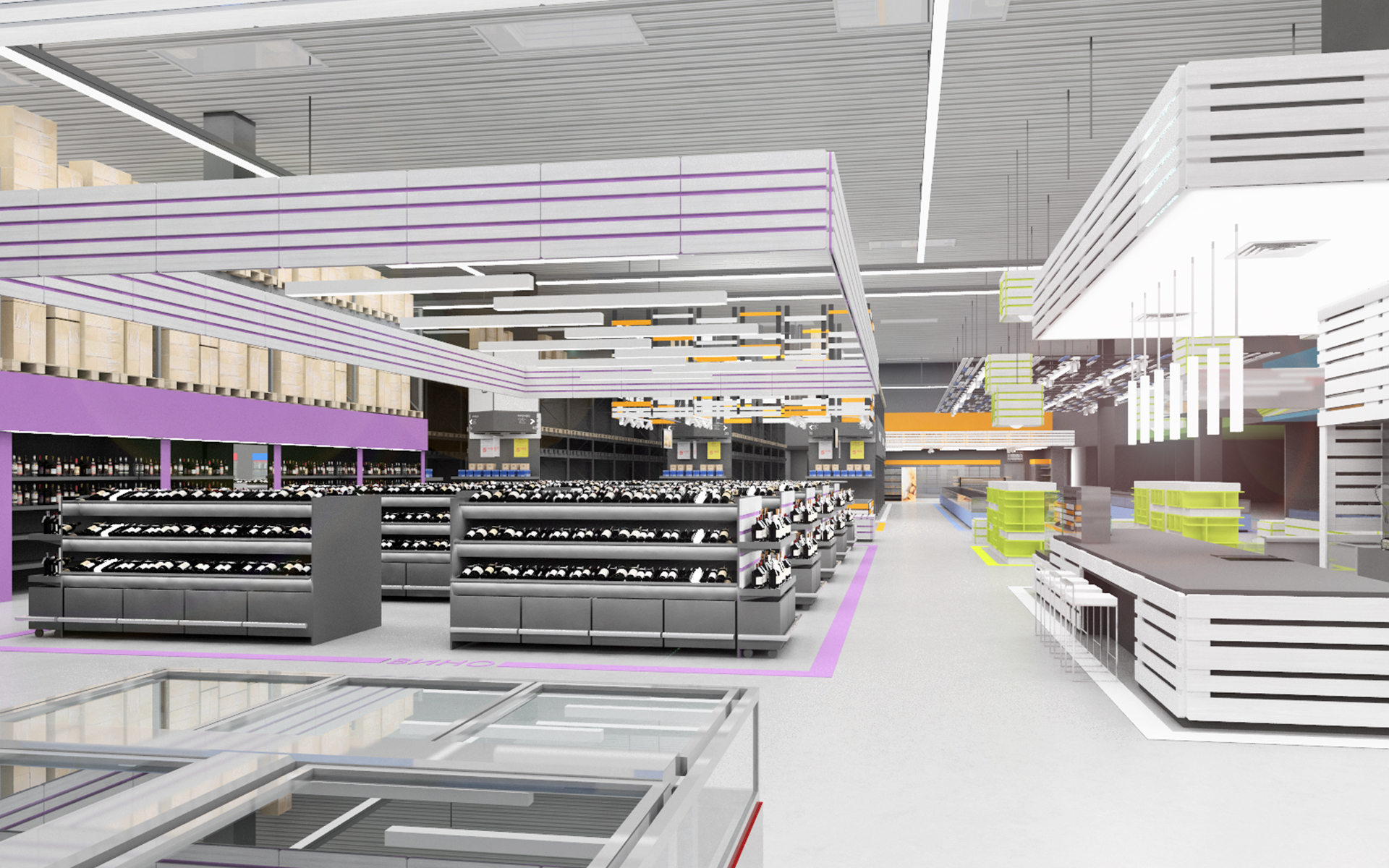
Spatial organization and visual impact are the main means of increasing sales in any type of retail, unrelated to purely commercial techniques outside the product and pricing policy of the company.
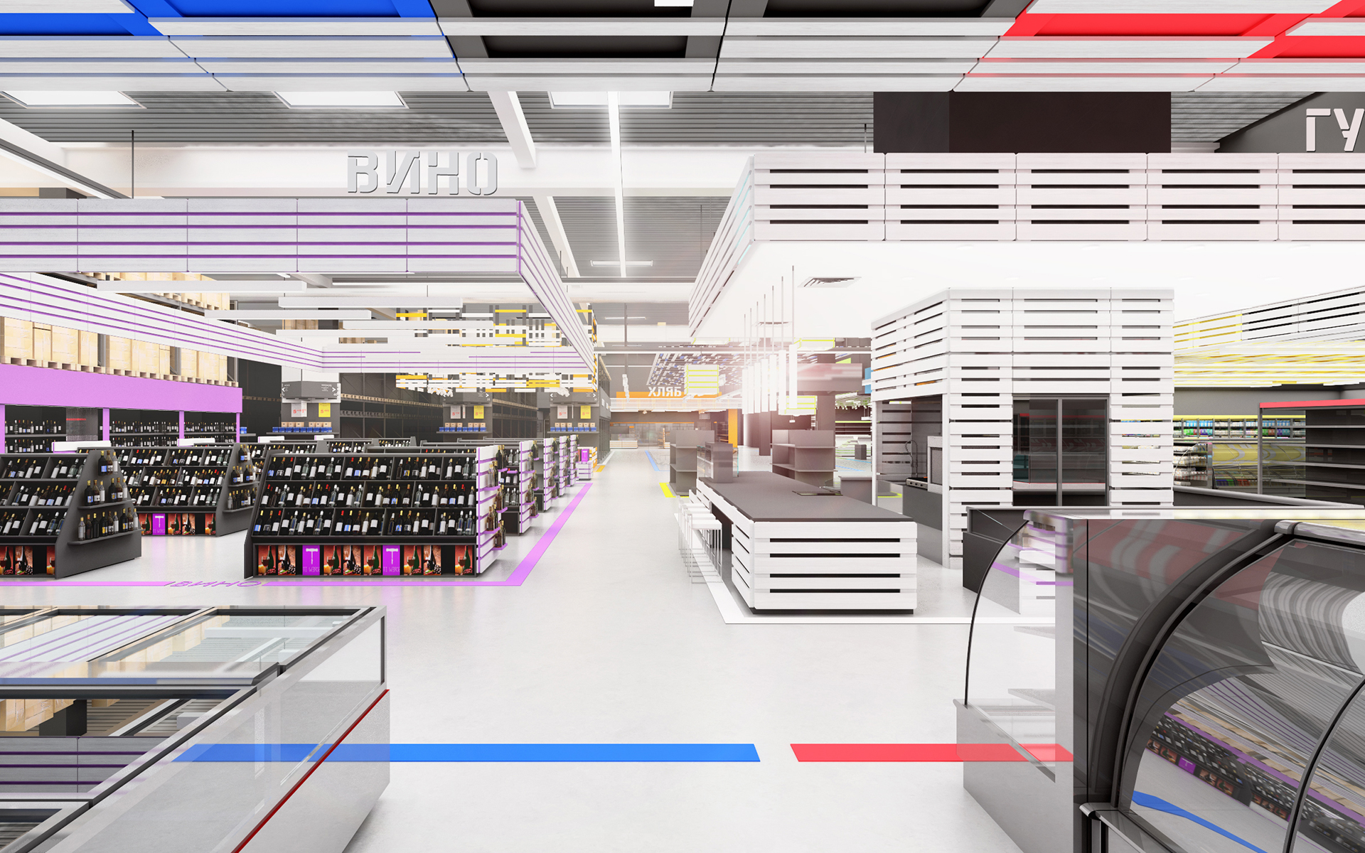
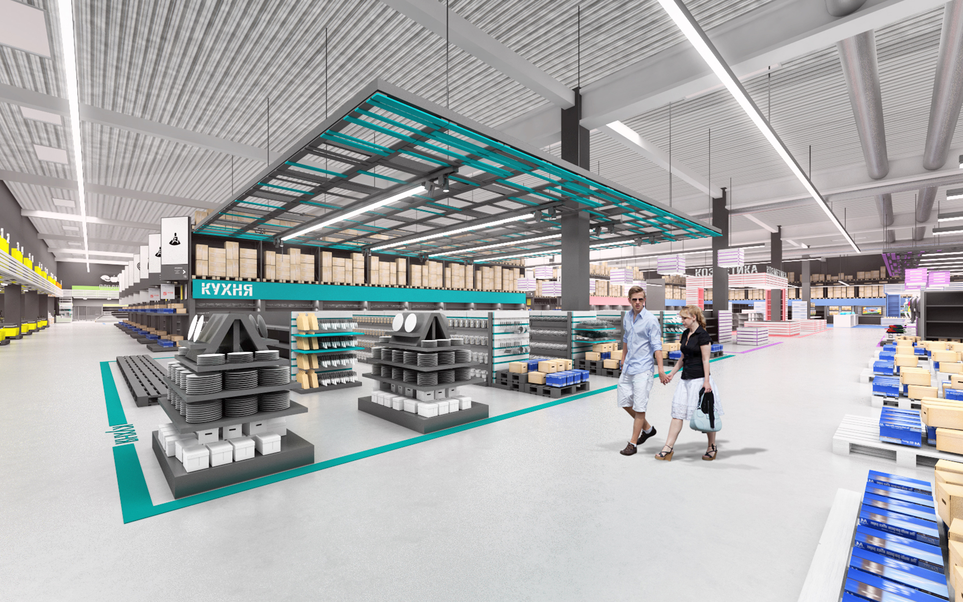
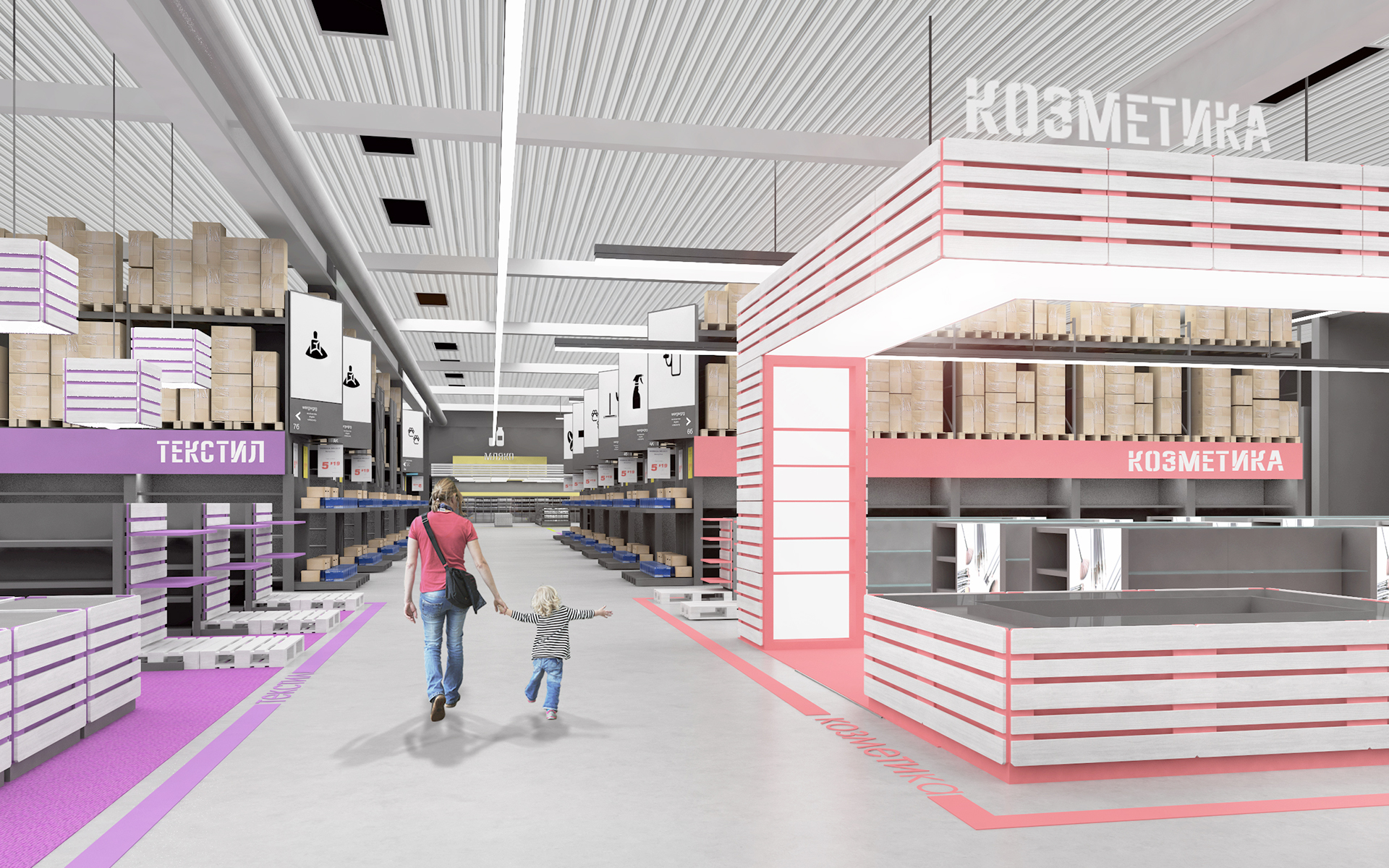
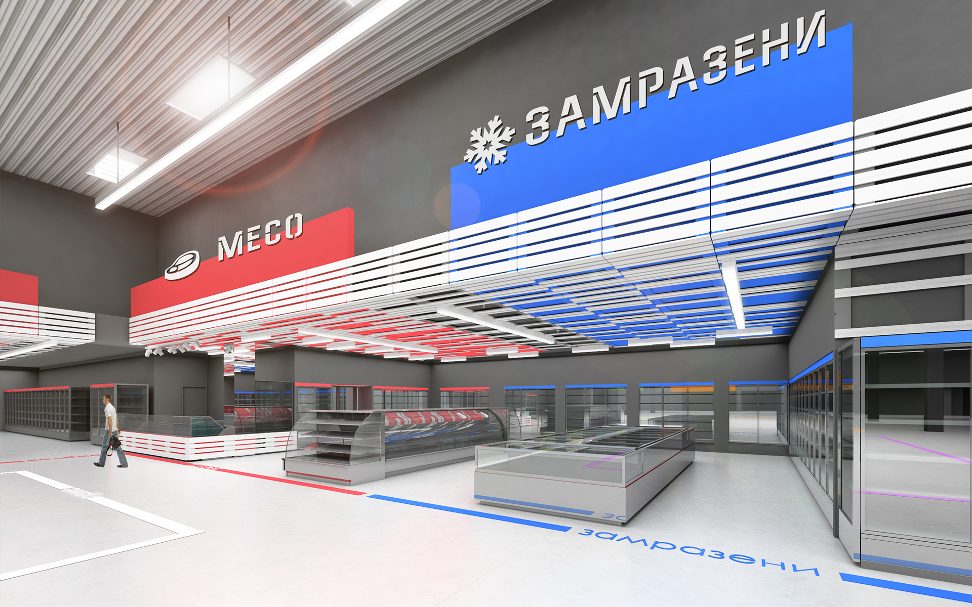
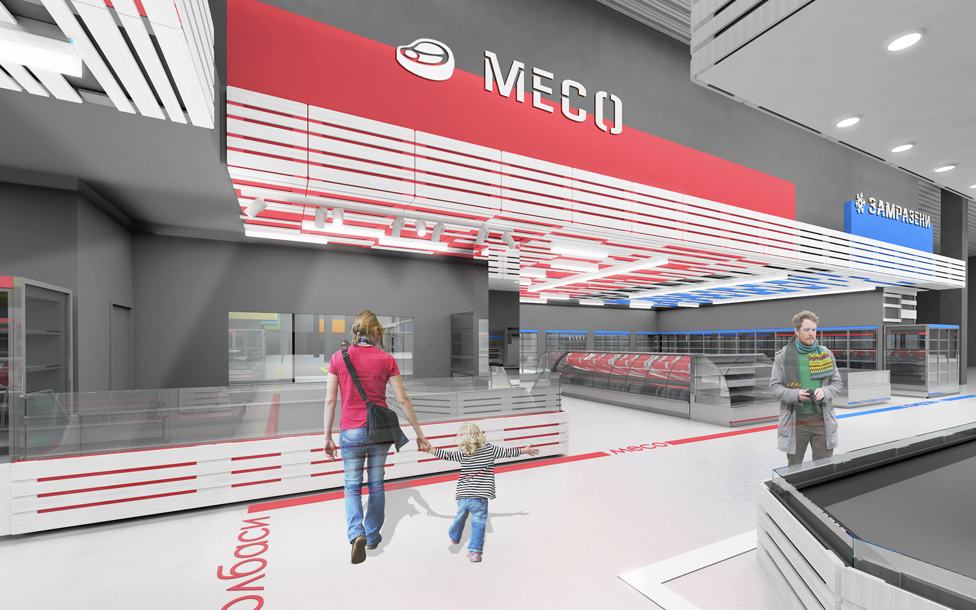
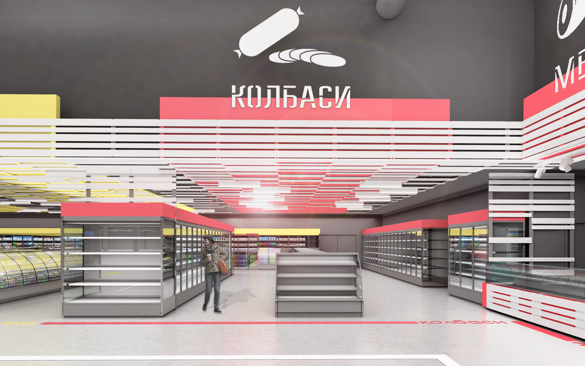
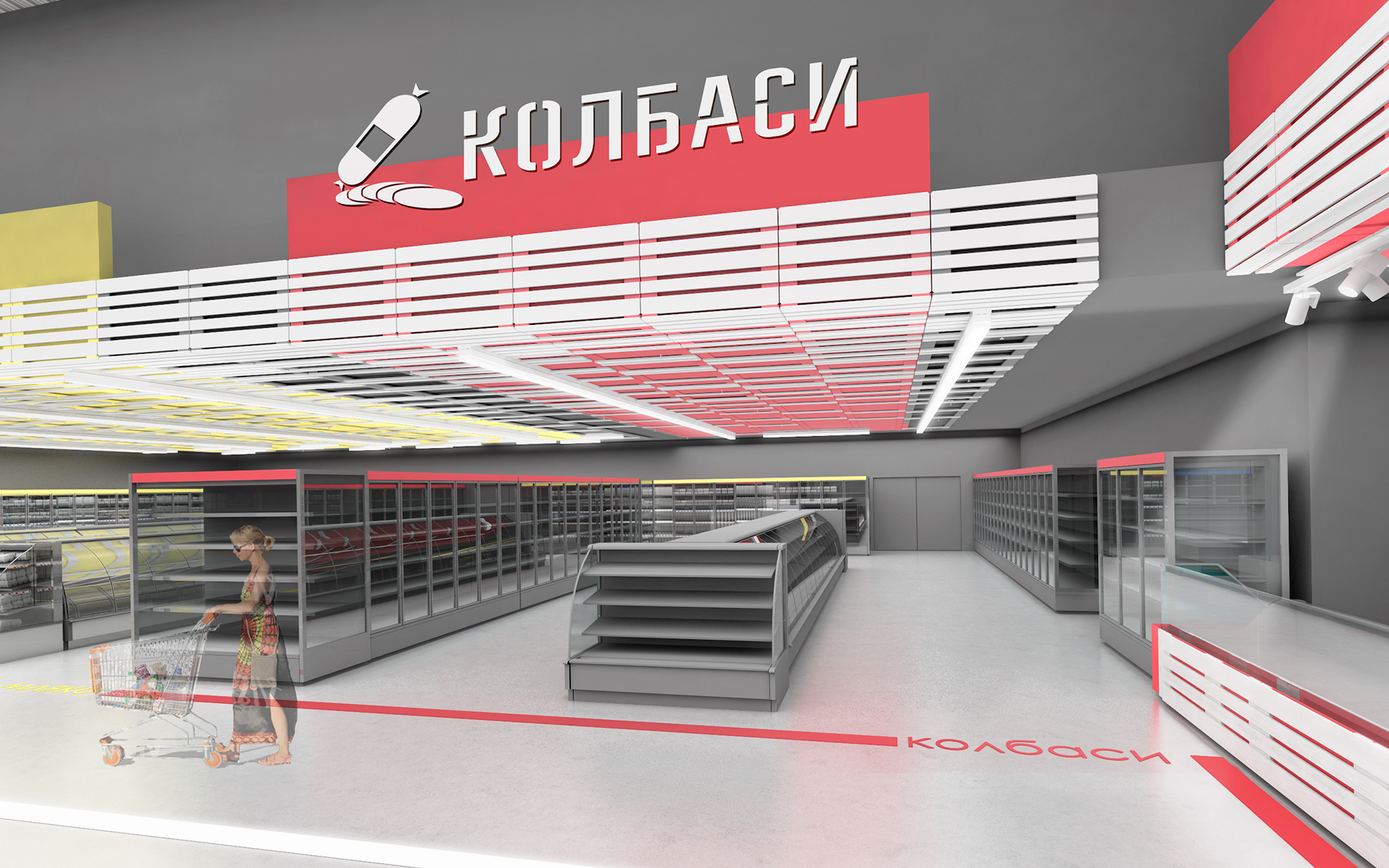
Within the existing arrangement, we have proposed emphasizing the main walking lines. They lead to the individual sectors following stripes in the floor, marked in color and inscription. This creates a common logic of orientation.
In our project proposal we have adhered several main characteristics of the proposed design:
- Preserve the overall radiance of the wholesale retailer chain and purposefully avoid "shining" and visual elements typical of boutiques.
- Maintaining the successful model for vertical functional division - low part - demonstration and small-package goods, high zone - above the level of human access - packaged storage area.
- Preservation of chain-specific elements of visual communication and keeping the overall corporate identity.
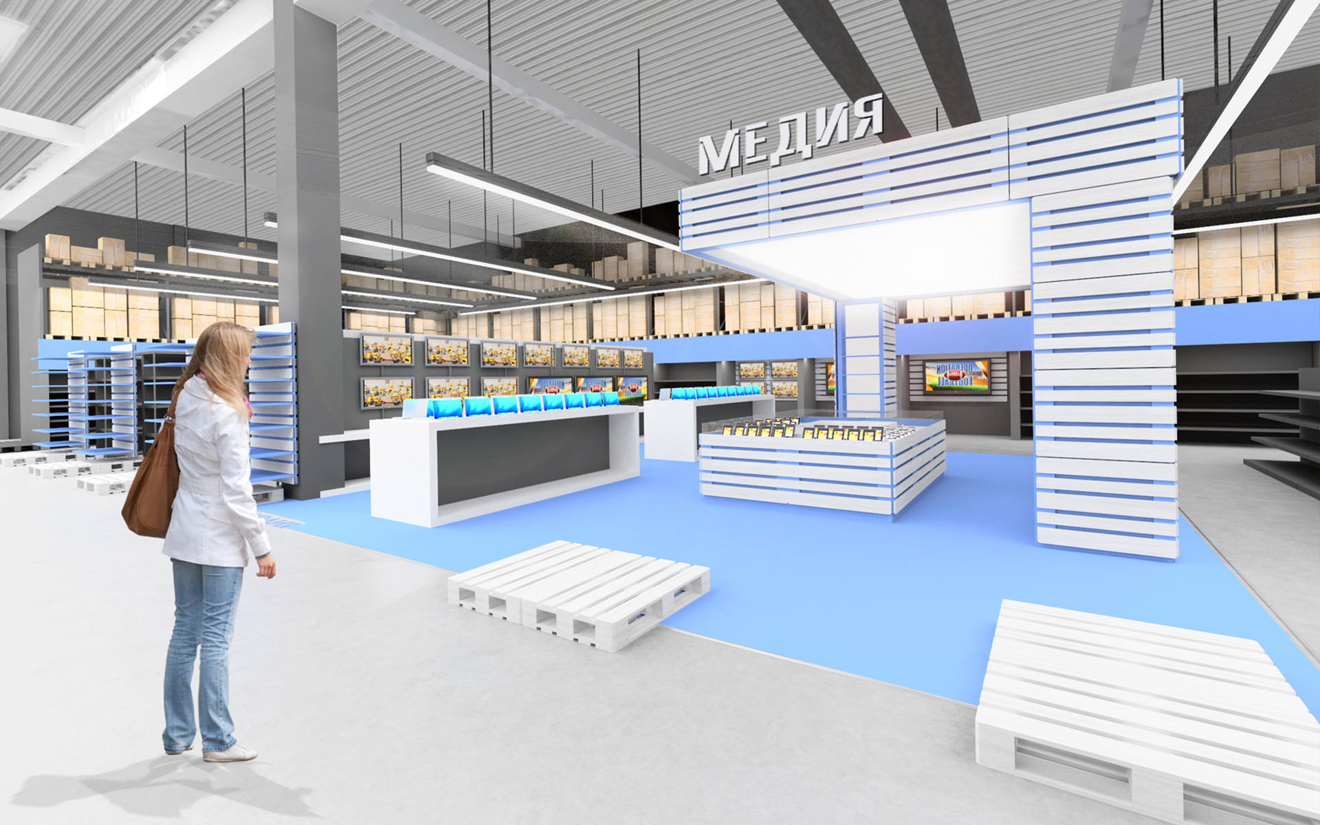
We take into account the installation time, the materials used and the versatility of the elements in a cheap and quickly applicable solution that can be easily multiplied in other locations. Such a solution for us is a design with palettes in white, designed on different color backgrounds, depending on the zones.
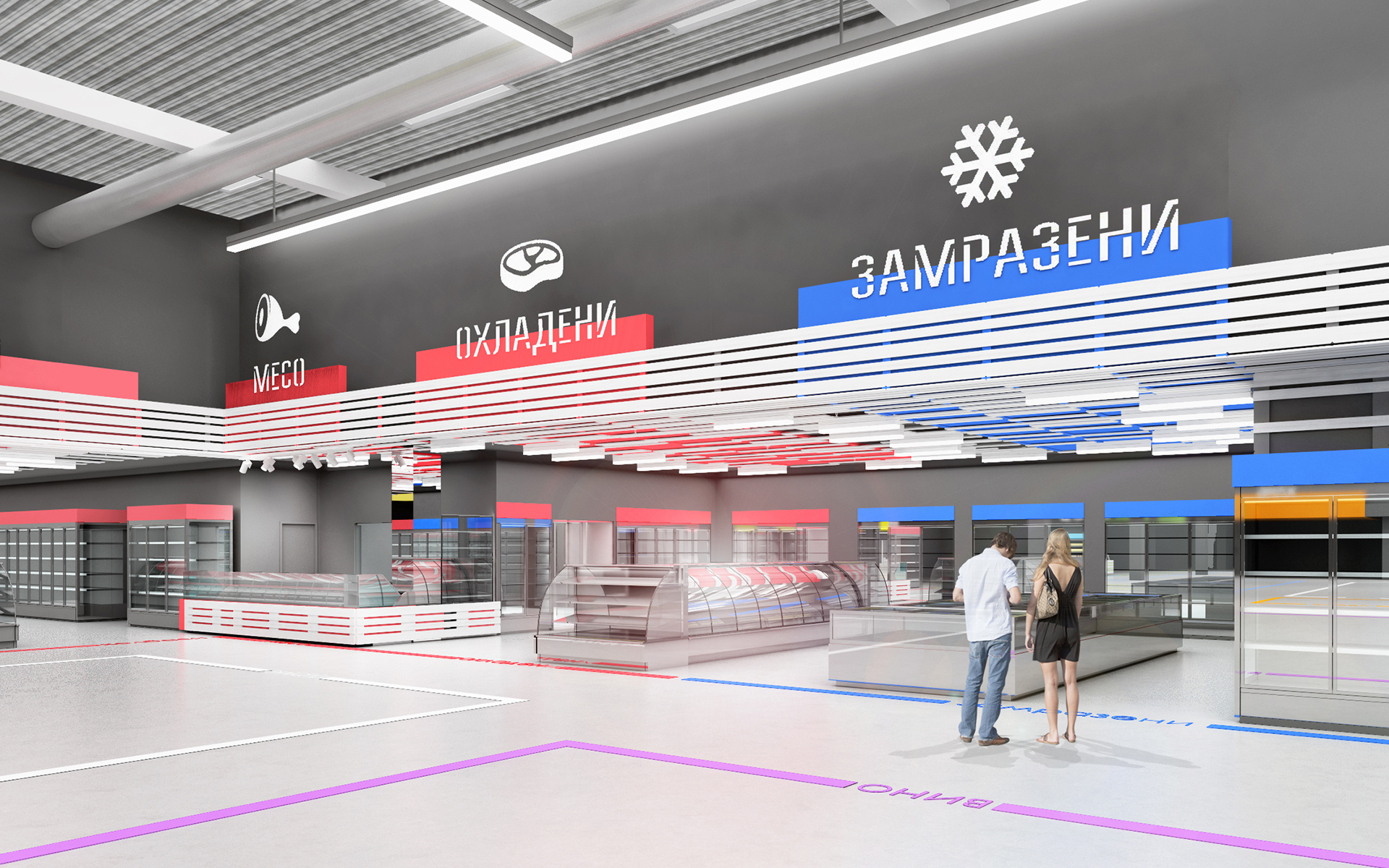
The commercial hall of the site is taking an area of 9000 sq.m. Within the total volume, the following clearly distinguishable areas can be found:
1. entrance
2. area with low shelves
3. area with high racks
4. food sector
5. cash register zone and post-cash zone
The separate zones differ from each other in color according to the different commodity groups, which predetermine their way of exposure and the peculiarities of loading and storage. We will look at all the zones consecutively.
The advantages of our solution are:
Functional zoning
The general scale differentiation of the zoning creates the mass memorable volumetric characteristics of each zone, which clearly distinguish them from each other. It makes it easier for the clients to oriented themselves.
"Where am I?" there is an unambiguous question for every customer who has visited a chain store at least once. Having a common spatial orientation contributes to the feeling of security - clear self-positioning is a factor in the general personal sense of "control".
Clear approach
Entrance / exit of the trade hall are accessible from the same main façade, as the cash register area is purposefully differentiated in its volumetric-spatial characteristics and are visible as soon as you enter the hall.
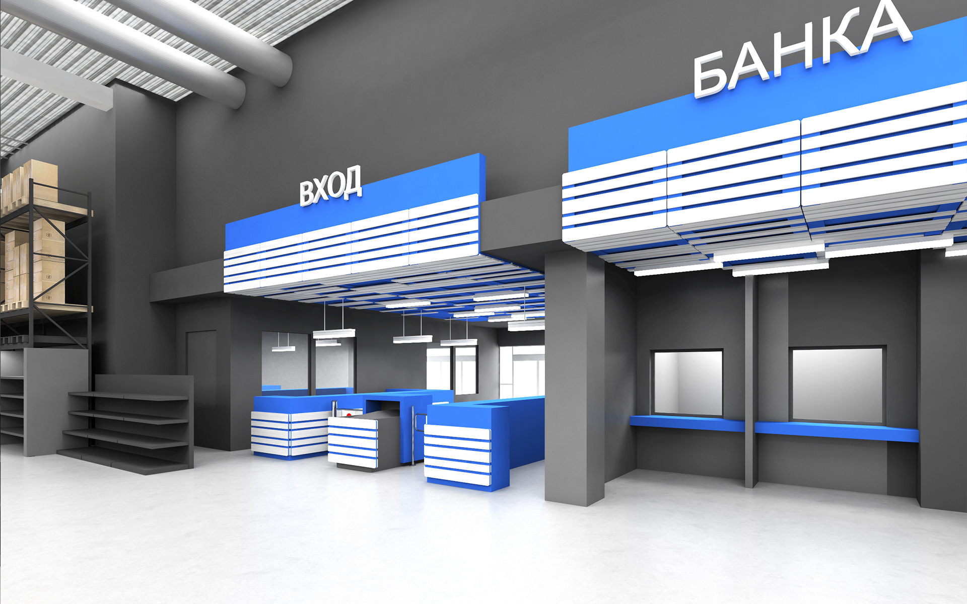
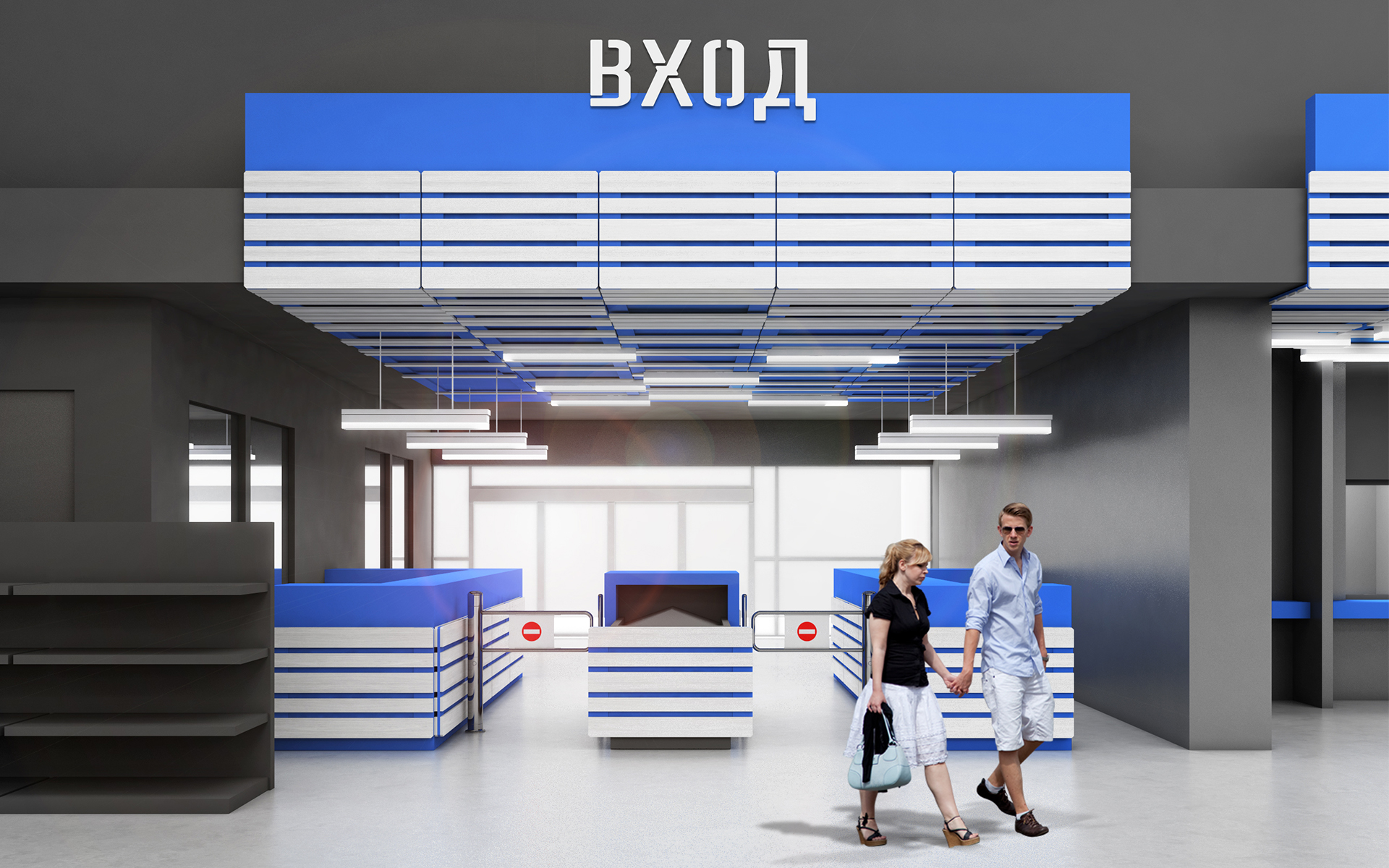
"Where's the way out?" is also a question with an almost unambiguous answer.
At the subconscious level, where the exit from the building is located in the space has a direct impact on the client's sense of security and tranquility, the "escape route" is a factor in creating the overall psychological comfort. In bright yellow, we recognize the boxes at a distance, which are practically on the way to the exit.
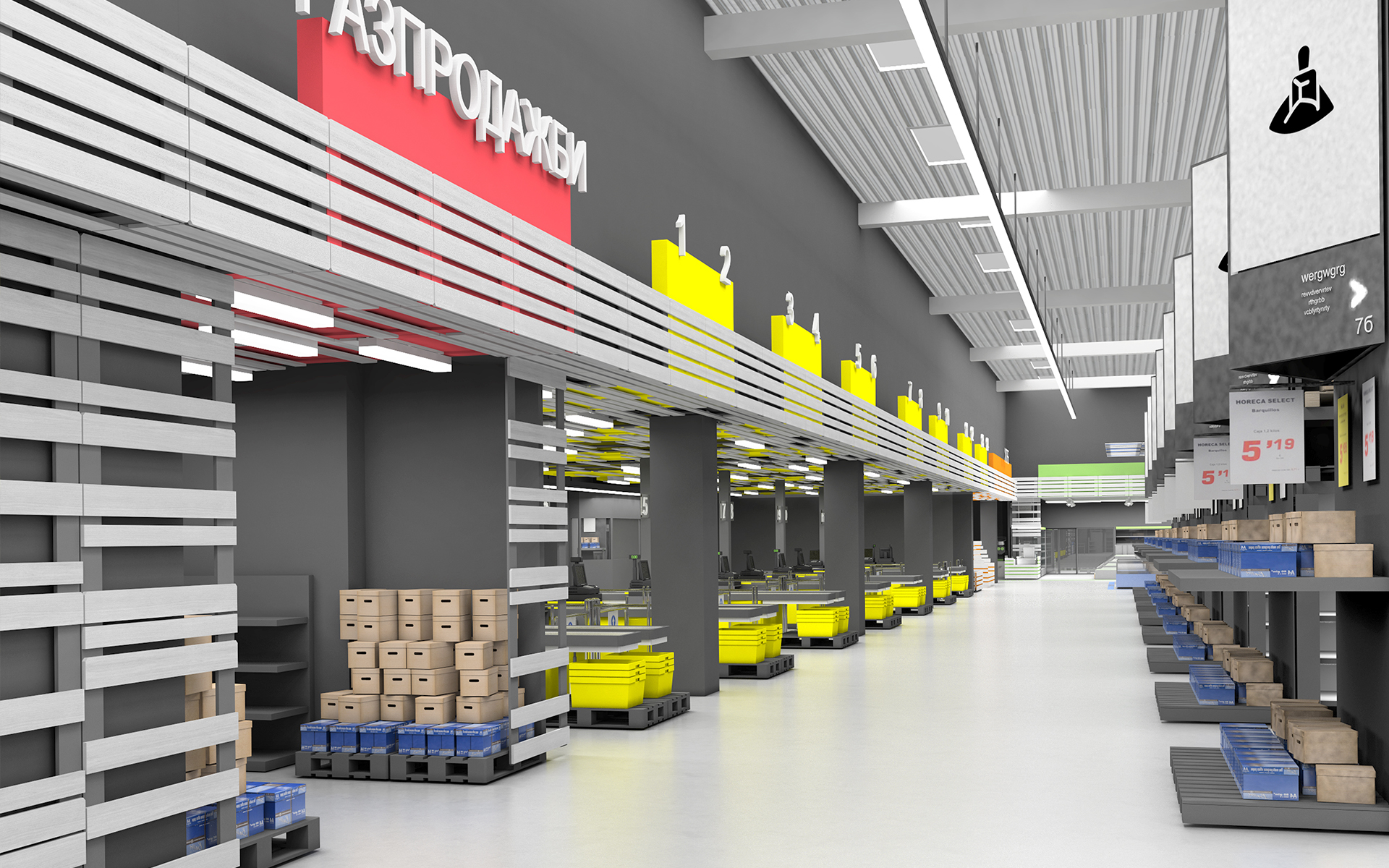
Main walking lines:
In the organization of the hall, several main corridors are clearly distinguished. They clearly define the main walking lines. They are of considerable width and serve as "distribution" to the individual commodity groups. Their presence, width and readability in space greatly contribute to good orientation.
The visit to the store starts with the "Kitchen" area.
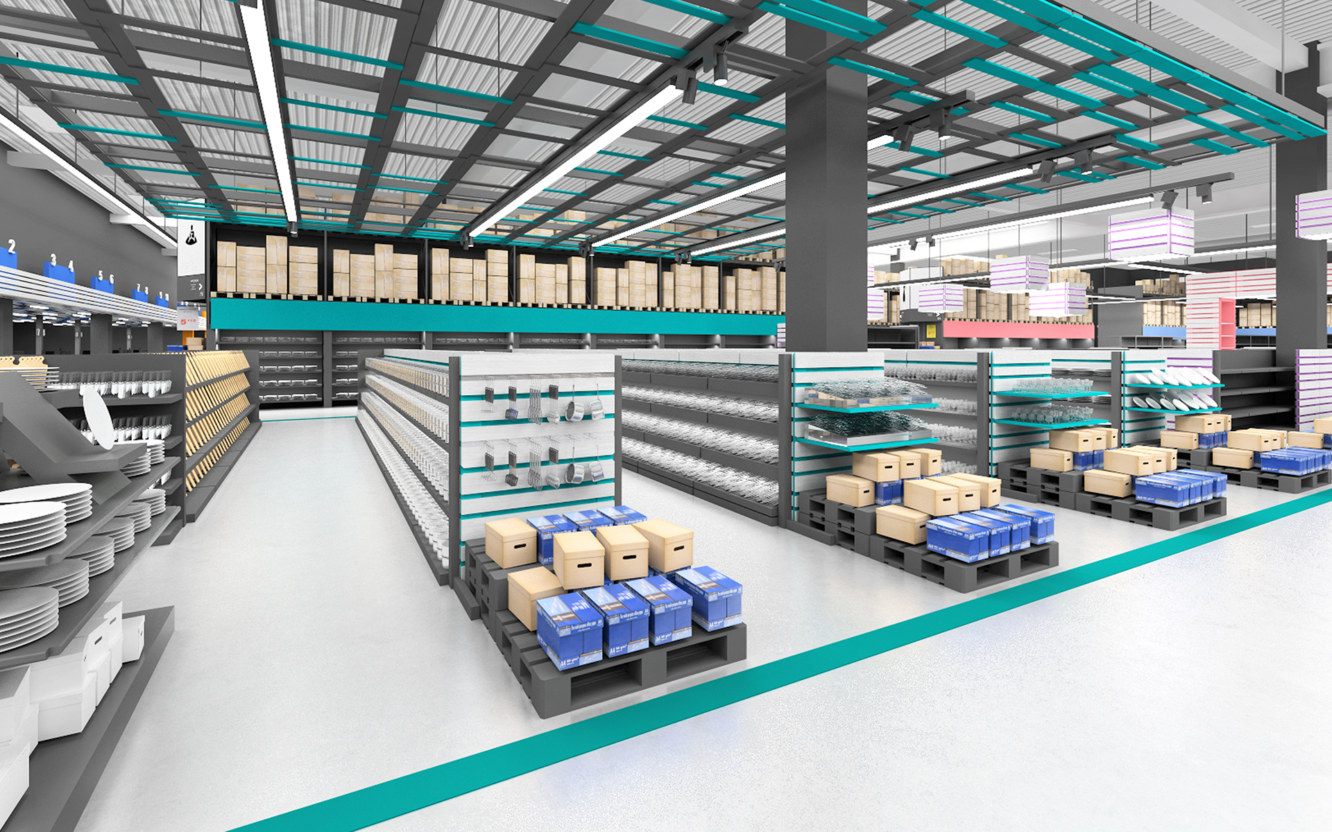
And on the opposite side it is the "Seasonal" zone, followed by "Clothing", "Sports" and "Textiles".
Each area is visually distinguished by color and colored lines that lead us to it.
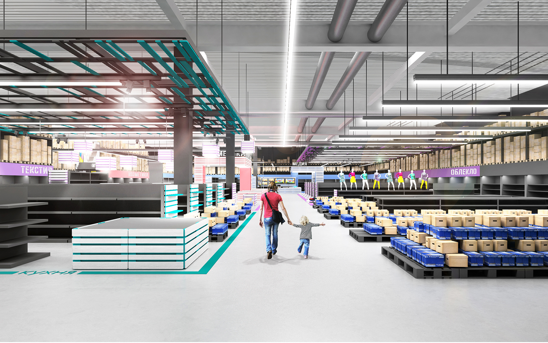
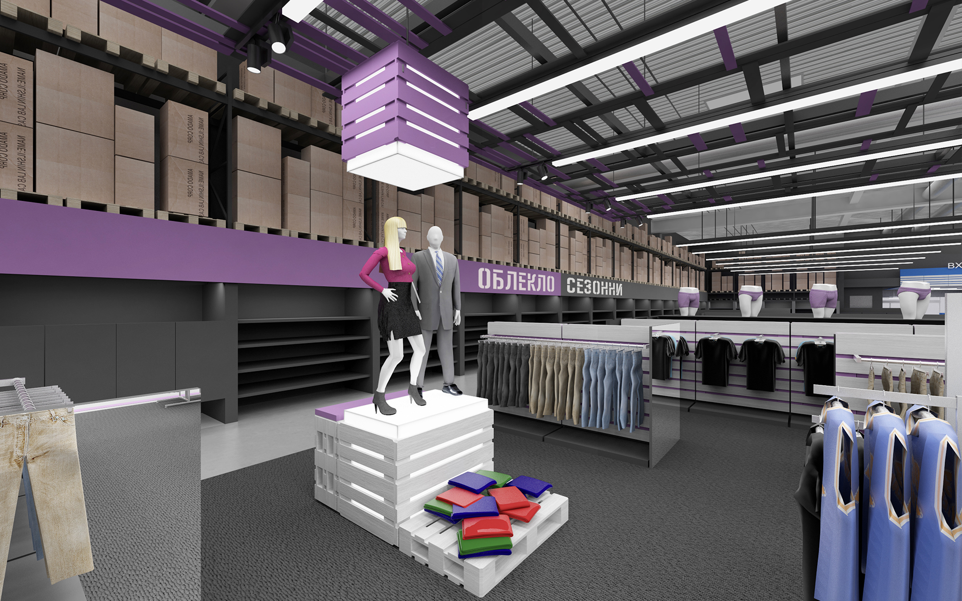
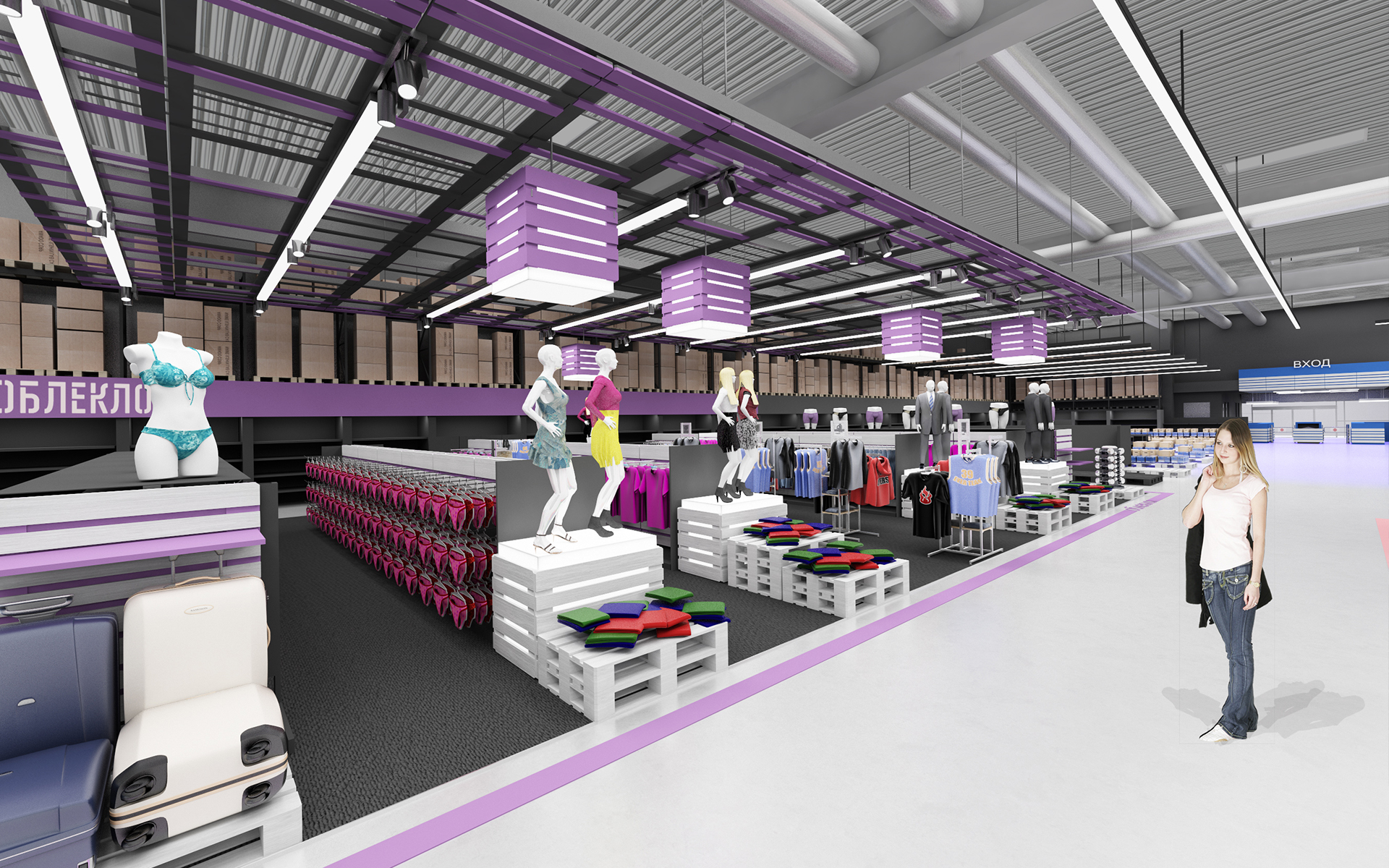
Orientation is easy and unmistakable.
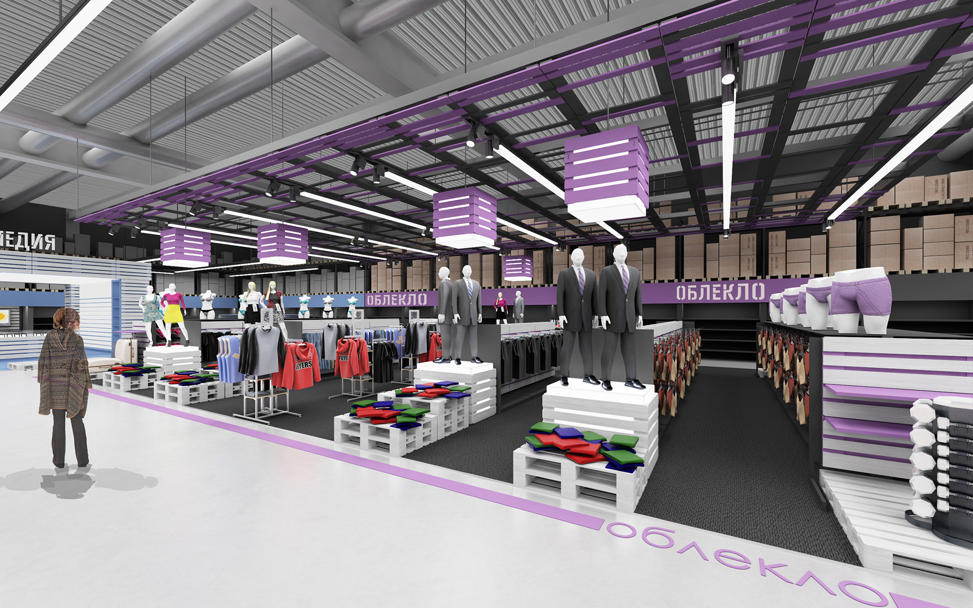
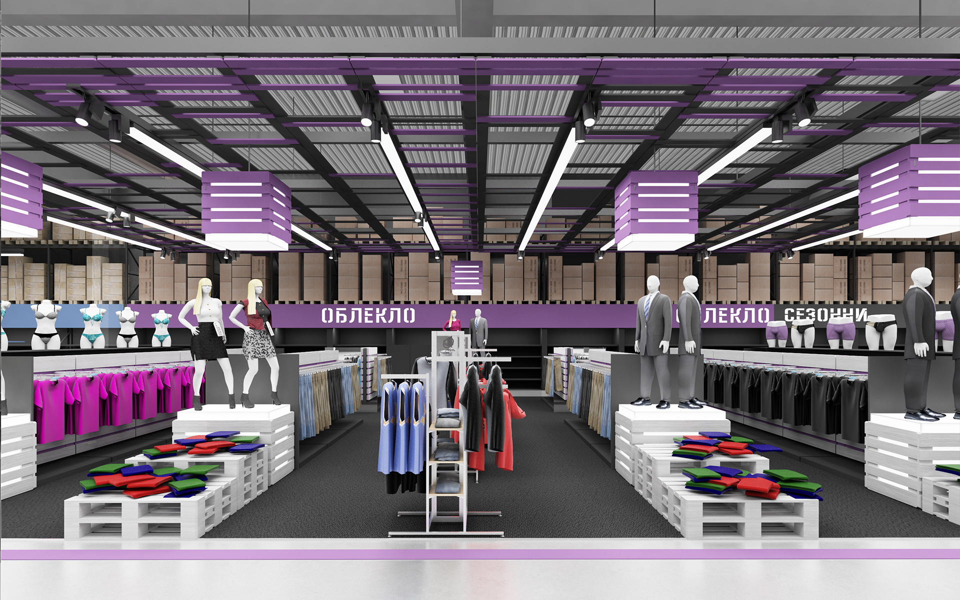
Logically follows the area "Cosmetics". The selected colors are associatively related to the goods offered in the zones.
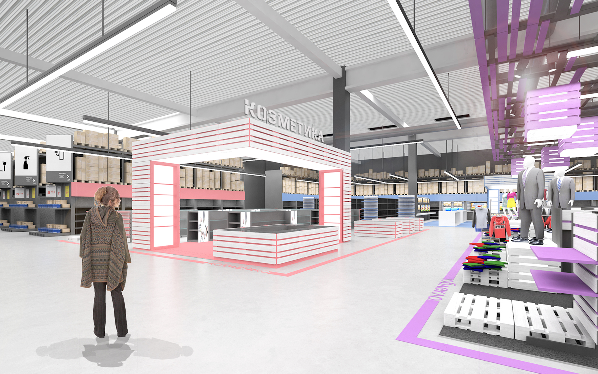
We pass the "Office" and "Media" appliances zone
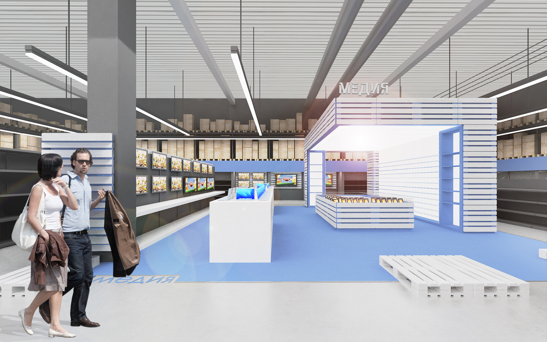
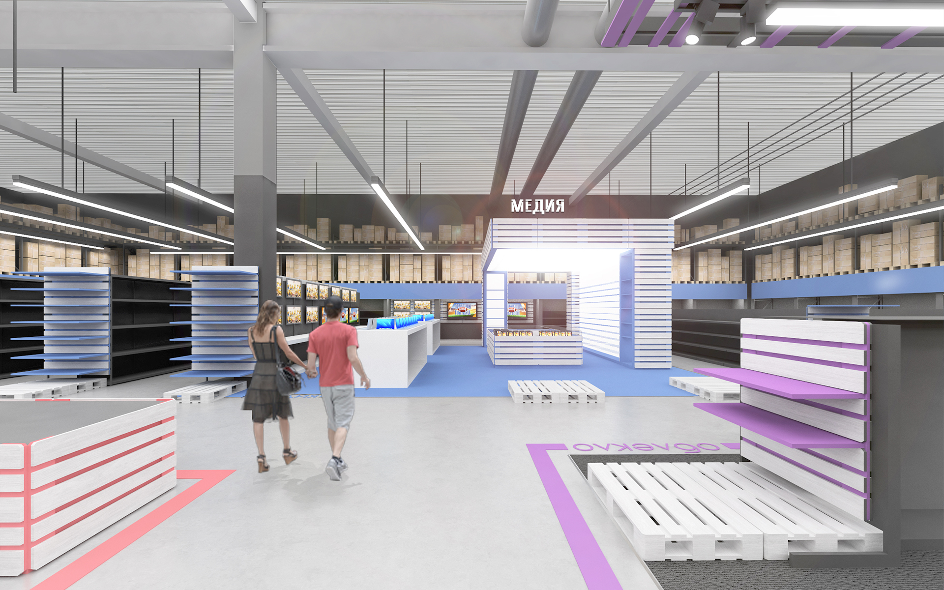
Next is the food zone.
Deep freezing.
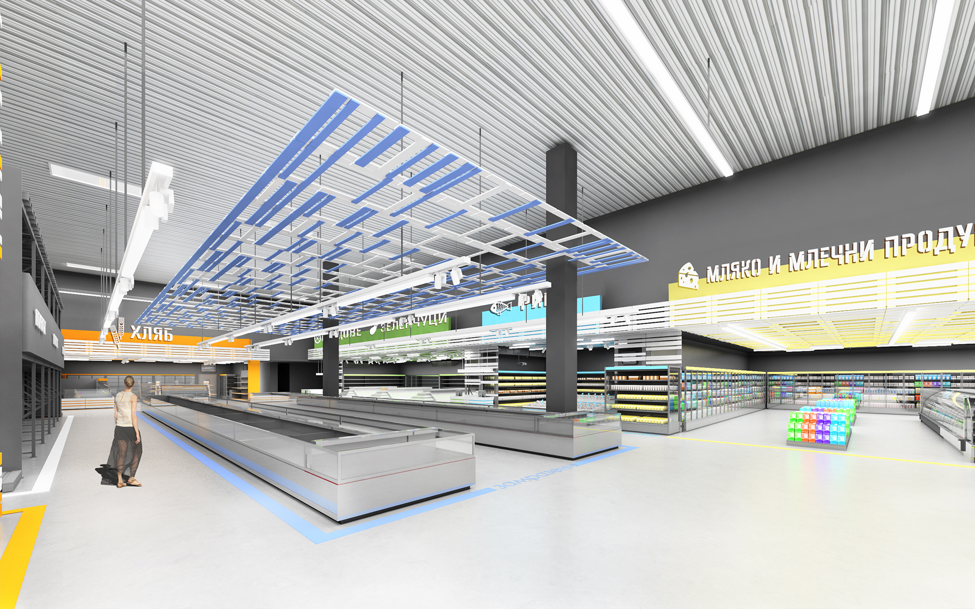
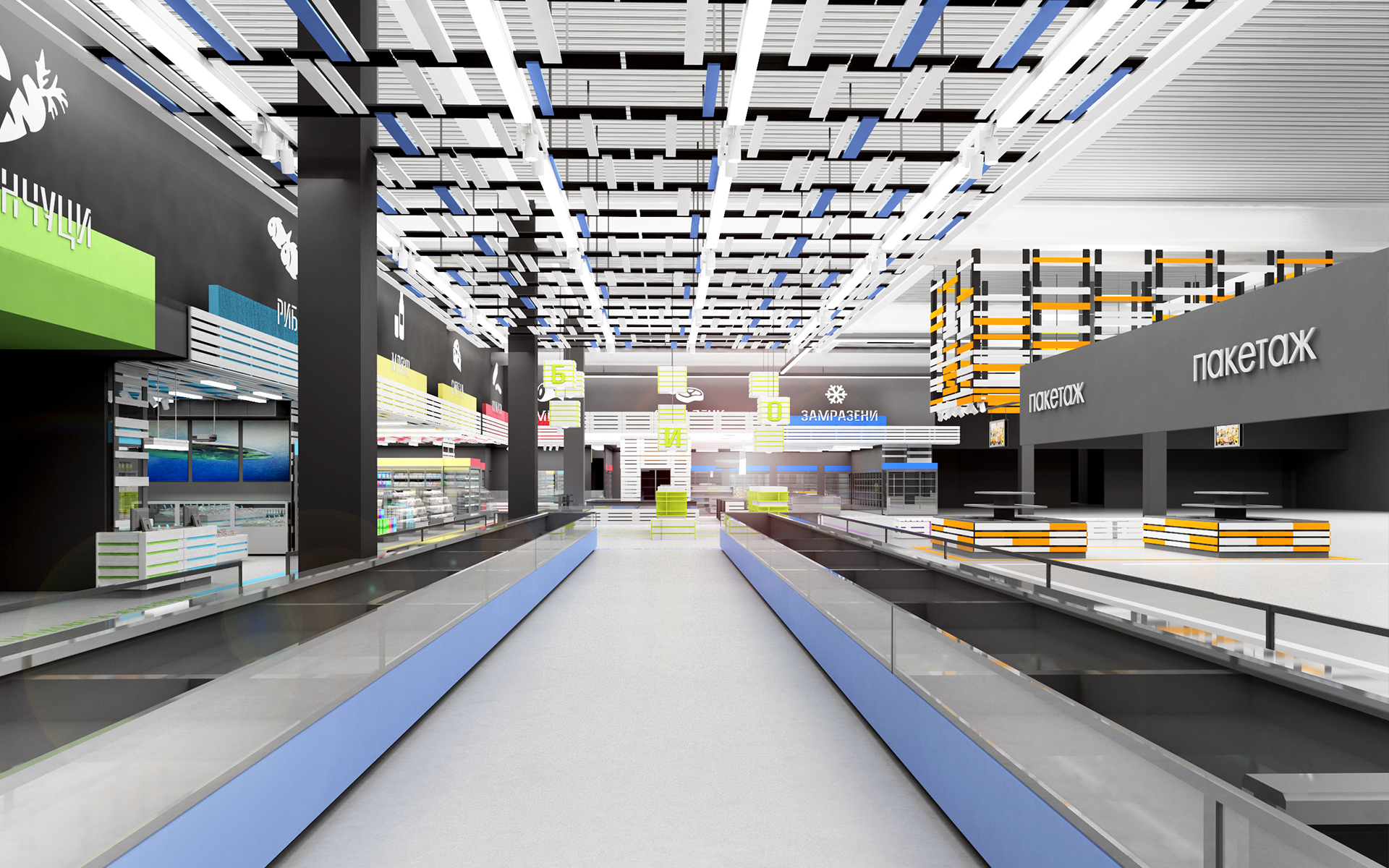
Frozen and meat products
Sausages and delicacies
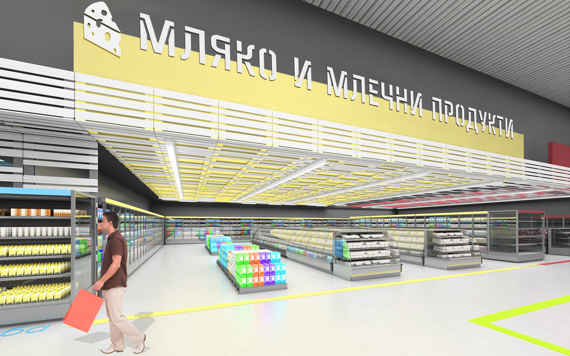
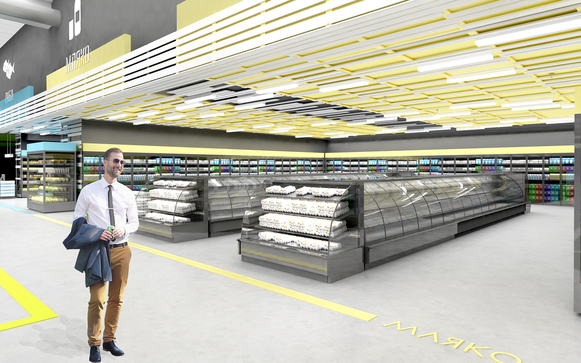
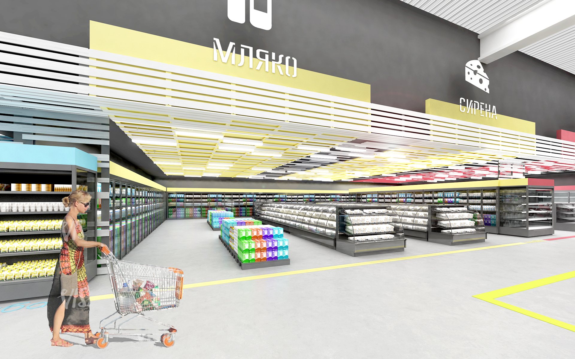
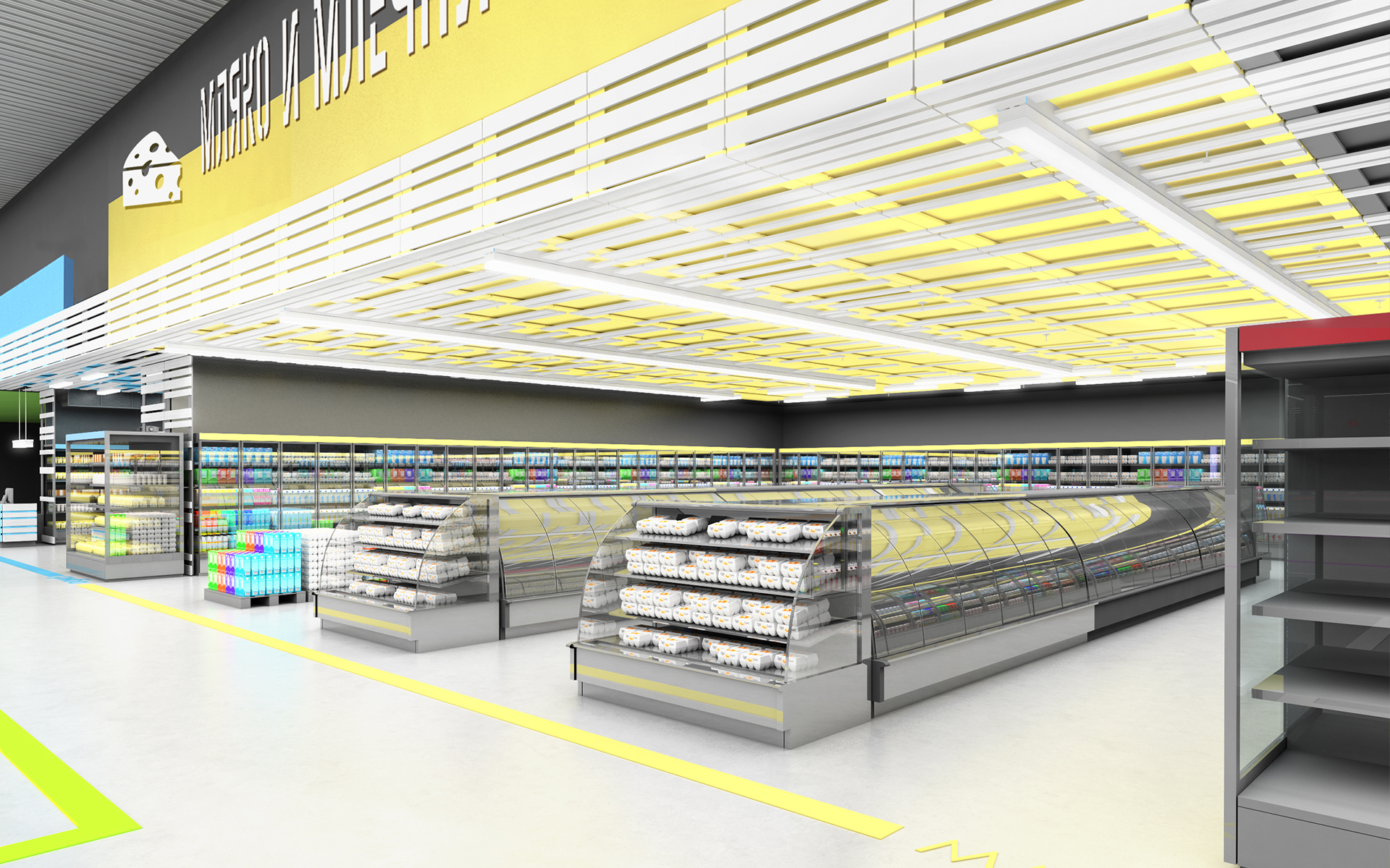
Dairy products
Fish and seafood
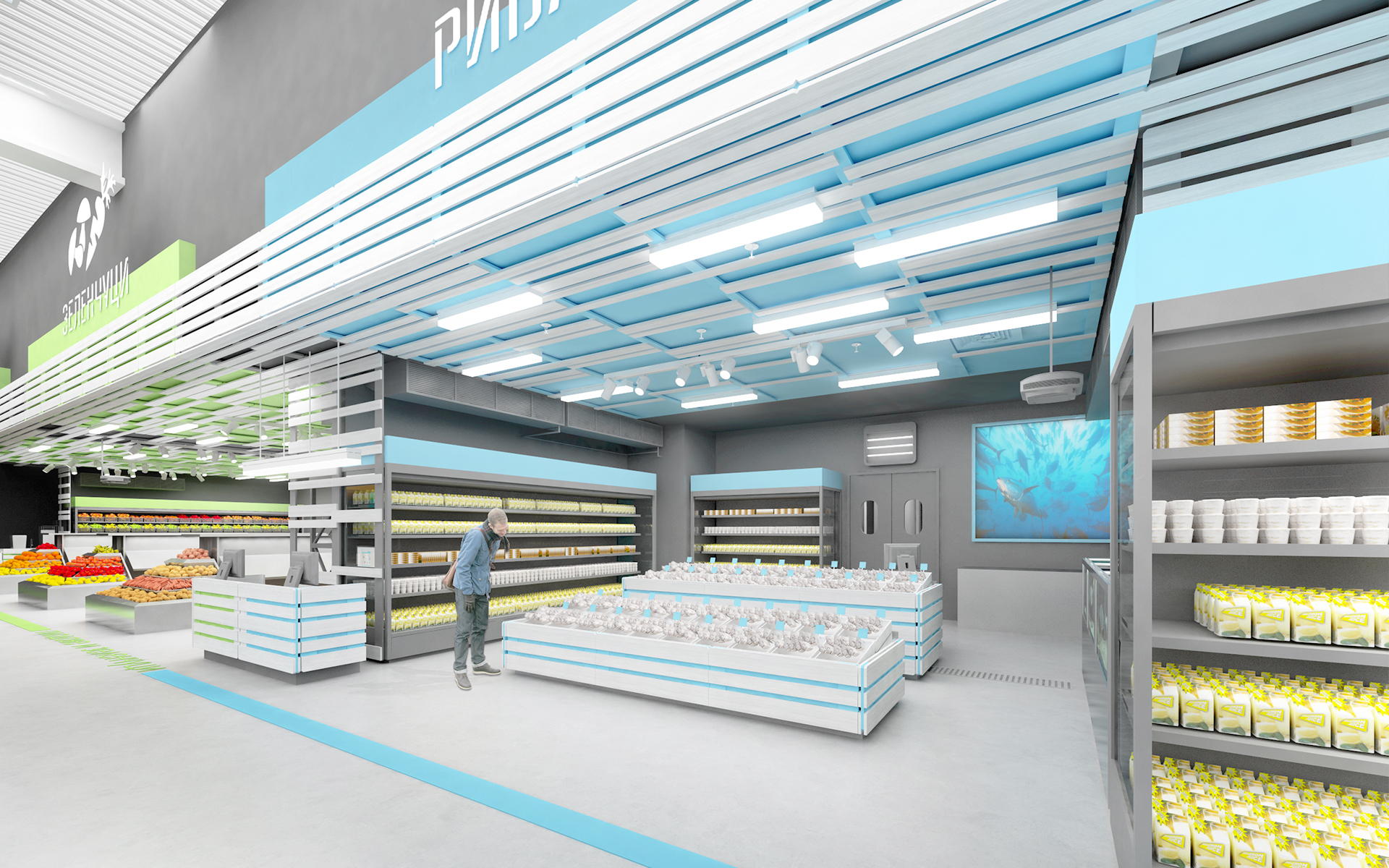
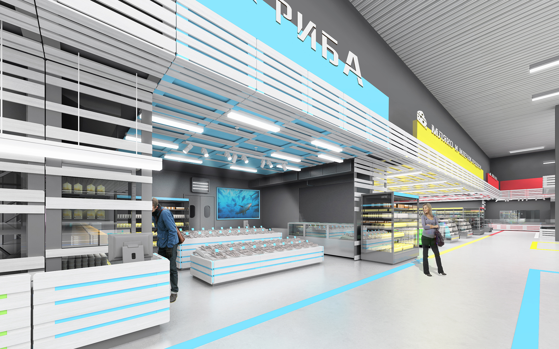
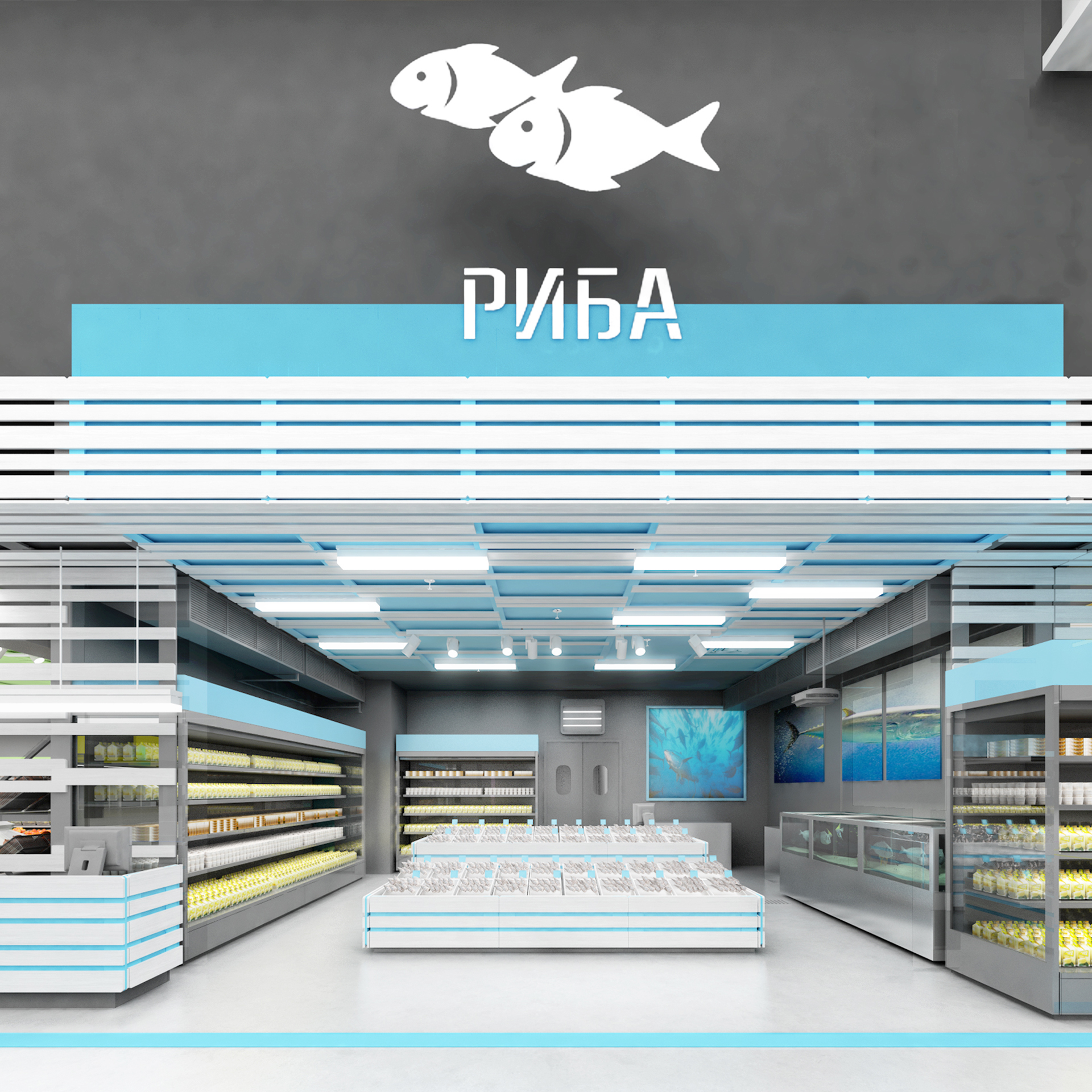
Fruits and vegetables
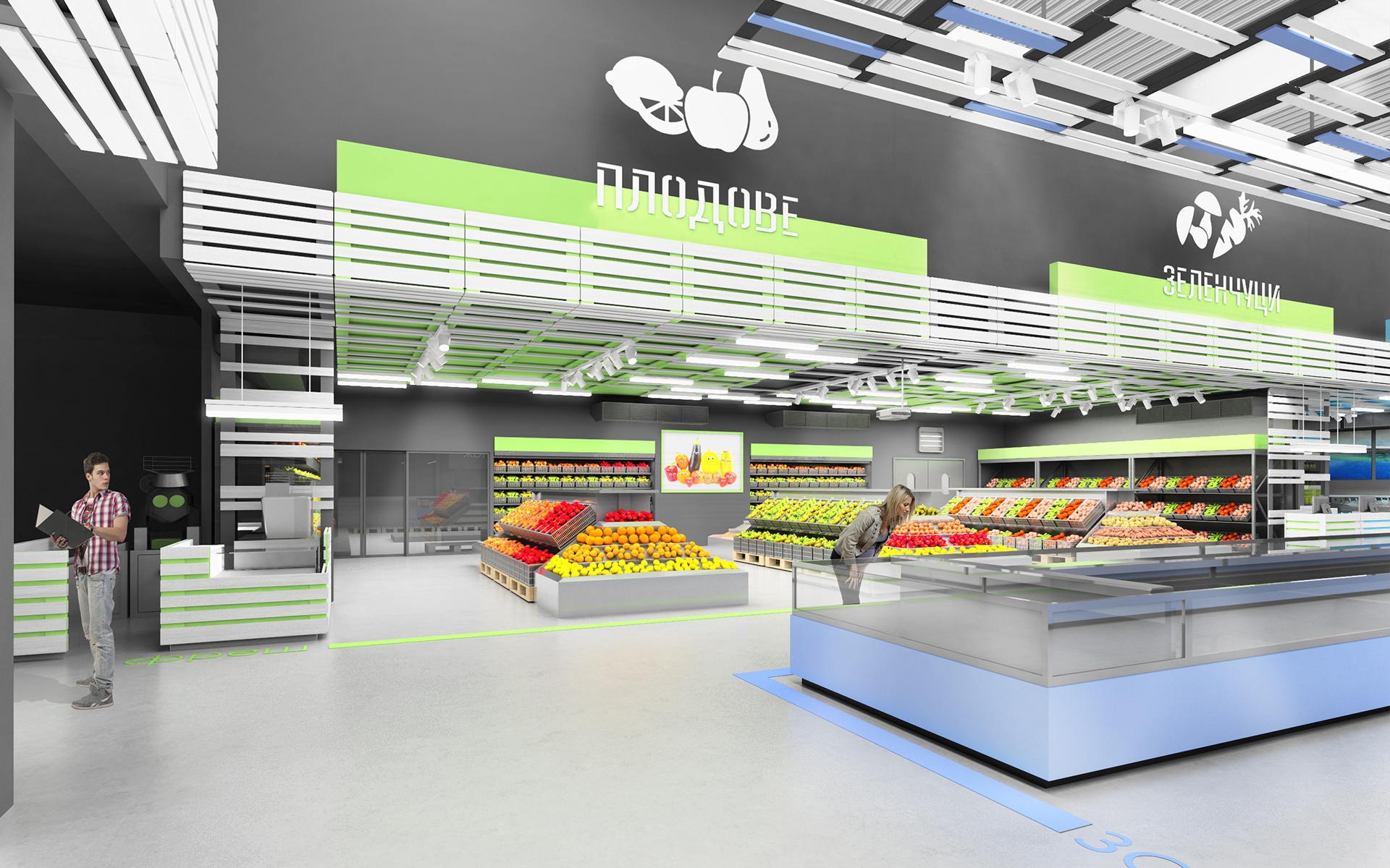
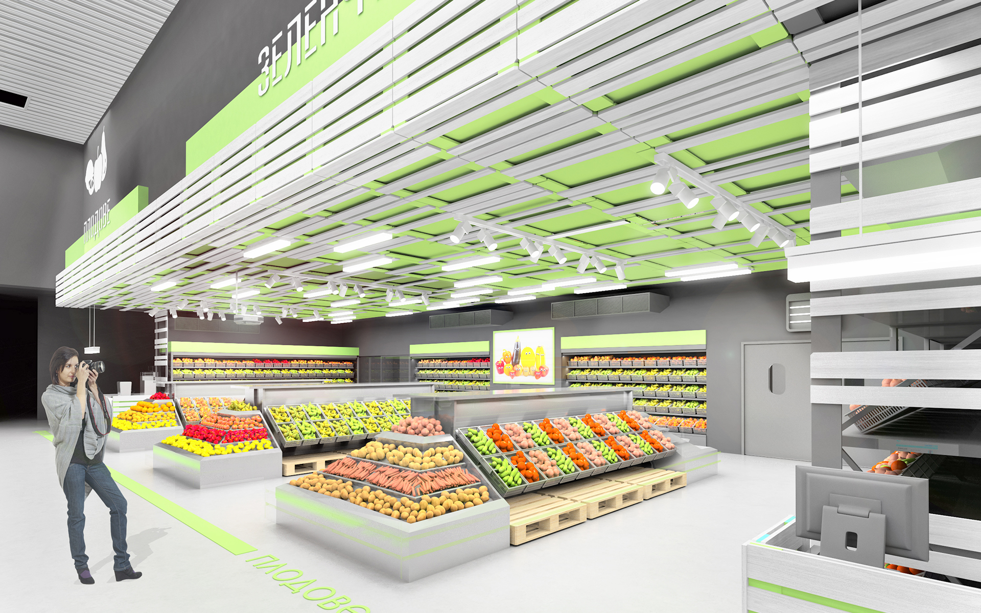
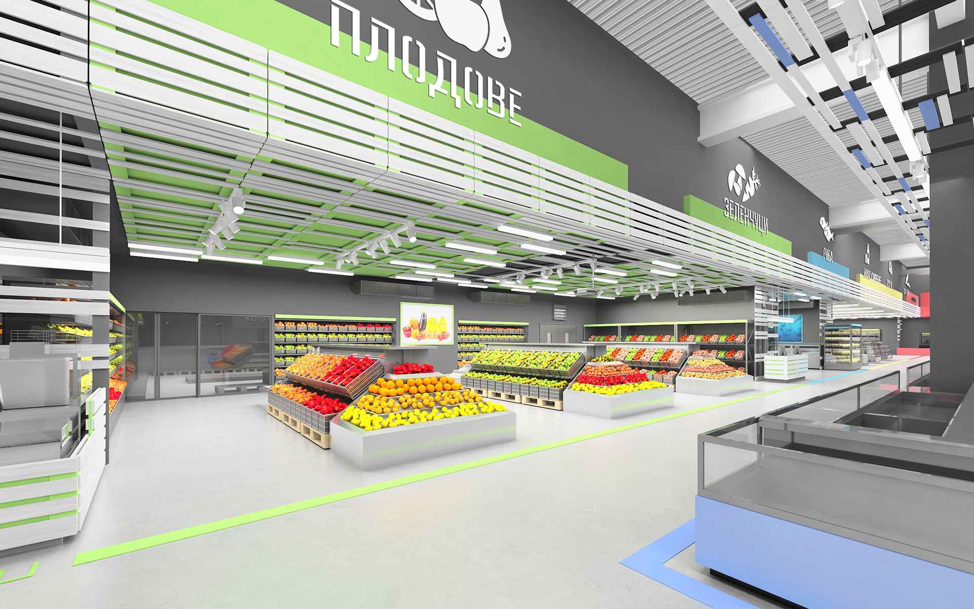
The "Bio" zone is especially attractive.
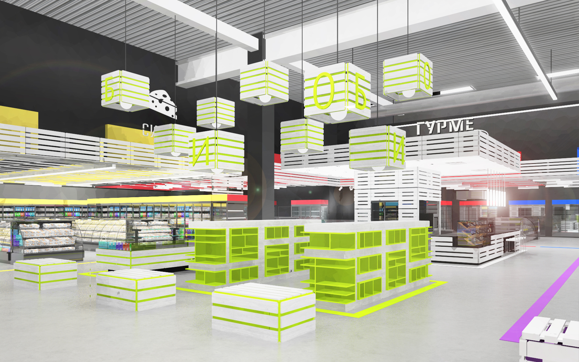
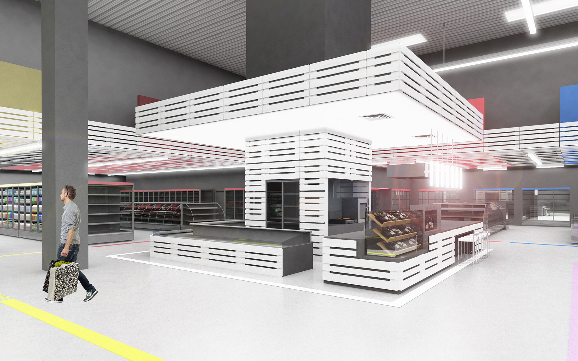
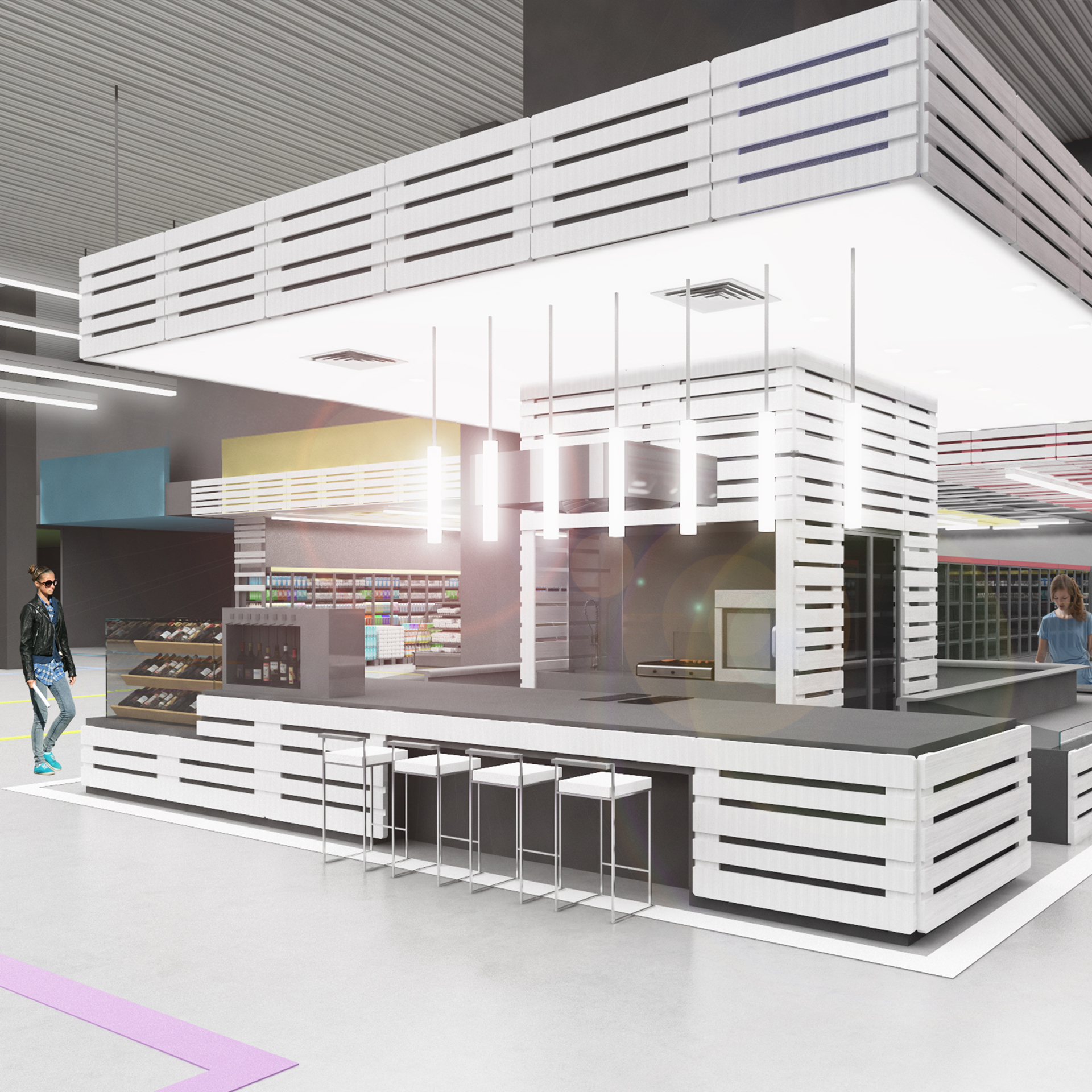
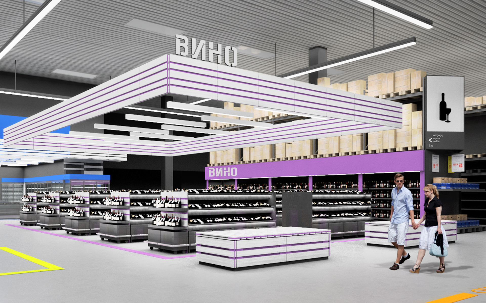
Near the "Gourmet" zone we reach the "Wine" zone.
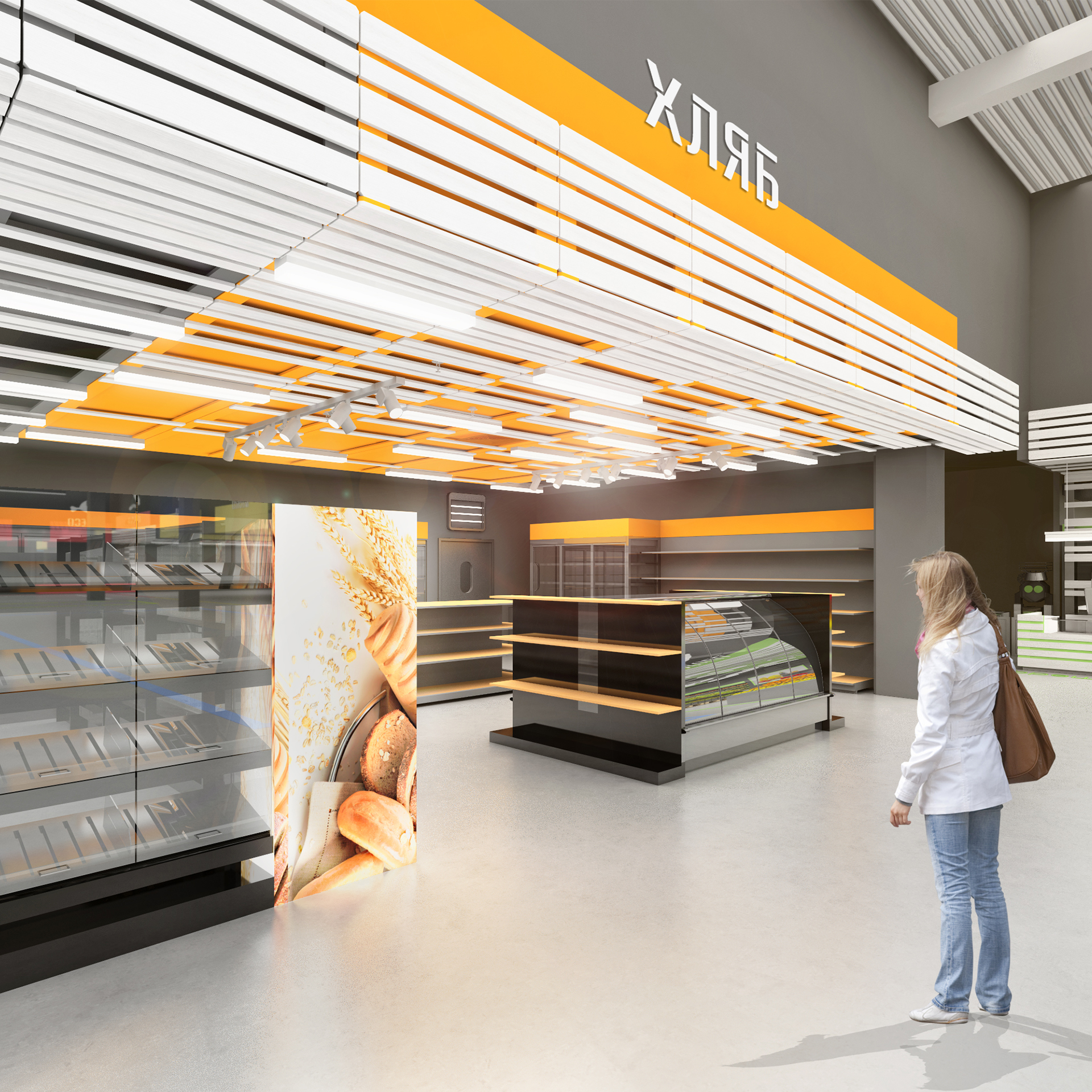
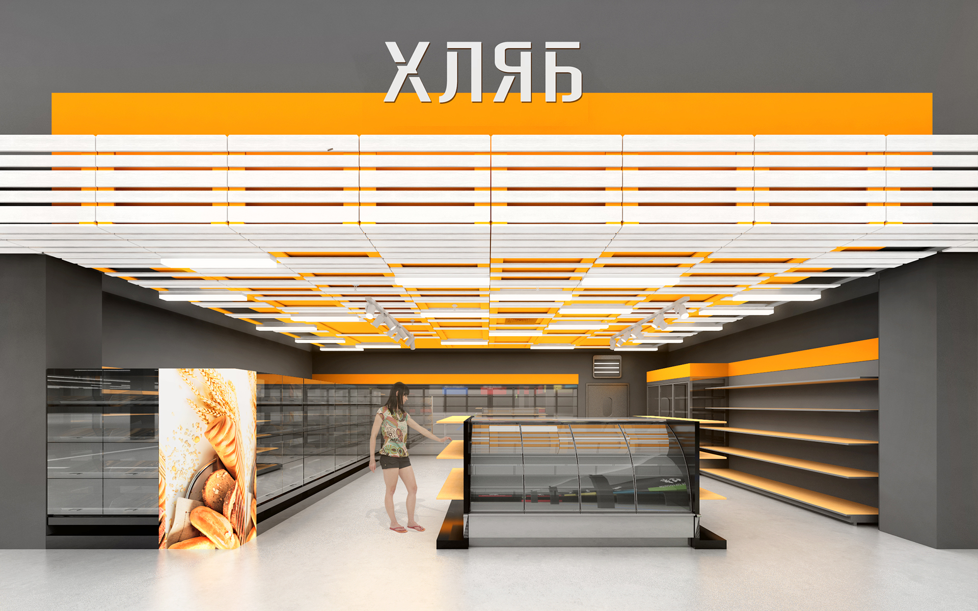
In the end of our shopping, a "Bread" area awaits us in a warm color
We are finally in the "Cash-register" zone.
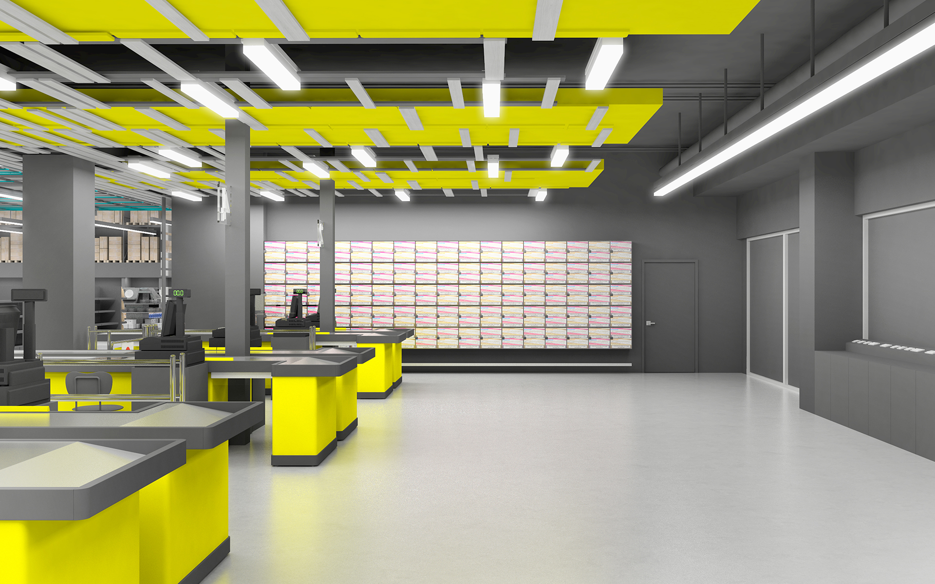
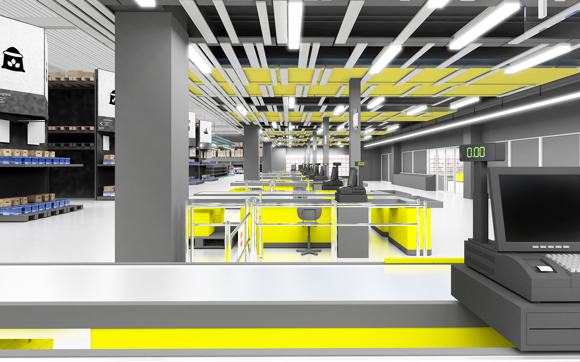
The shopping ends here, and we are left with the hope that we will see our project realized.
Designing an interior for a METRO hypermarket is a really big challenge.
A brand with an imposed standard German design, which does not go beyond the framework of the defined design model, suddenly decides to appear with a unique regional design, organizing a competition for this purpose. And we won it! ...
Spatial organization and visual impact are the main means of increasing sales in any type of retail, unrelated to purely commercial techniques outside the product and pricing policy of the company.
Within the existing arrangement, we have proposed emphasizing the main walking lines. They lead to the individual sectors following stripes in the floor, marked in color and inscription. This creates a common logic of orientation.
In our project proposal we have adhered several main characteristics of the proposed design:
- Preserve the overall radiance of the wholesale retailer chain and purposefully avoid "shining" and visual elements typical of boutiques.
- Maintaining the successful model for vertical functional division - low part - demonstration and small-package goods, high zone - above the level of human access - packaged storage area.
- Preservation of chain-specific elements of visual communication and keeping the overall corporate identity.
We take into account the installation time, the materials used and the versatility of the elements in a cheap and quickly applicable solution that can be easily multiplied in other locations. Such a solution for us is a design with palettes in white, designed on different color backgrounds, depending on the zones.
The commercial hall of the site is taking an area of 9000 sq.m. Within the total volume, the following clearly distinguishable areas can be found:
1. entrance
2. area with low shelves
3. area with high racks
4. food sector
5. cash register zone and post-cash zone
The separate zones differ from each other in color according to the different commodity groups, which predetermine their way of exposure and the peculiarities of loading and storage. We will look at all the zones consecutively.
The advantages of our solution are:
Functional zoning
The general scale differentiation of the zoning creates the mass memorable volumetric characteristics of each zone, which clearly distinguish them from each other. It makes it easier for the clients to oriented themselves.
"Where am I?" there is an unambiguous question for every customer who has visited a chain store at least once. Having a common spatial orientation contributes to the feeling of security - clear self-positioning is a factor in the general personal sense of "control".
Clear approach
Entrance / exit of the trade hall are accessible from the same main façade, as the cash register area is purposefully differentiated in its volumetric-spatial characteristics and are visible as soon as you enter the hall.
"Where's the way out?" is also a question with an almost unambiguous answer.
At the subconscious level, where the exit from the building is located in the space has a direct impact on the client's sense of security and tranquility, the "escape route" is a factor in creating the overall psychological comfort. In bright yellow, we recognize the boxes at a distance, which are practically on the way to the exit.
Main walking lines:
In the organization of the hall, several main corridors are clearly distinguished. They clearly define the main walking lines. They are of considerable width and serve as "distribution" to the individual commodity groups. Their presence, width and readability in space greatly contribute to good orientation.
The visit to the store starts with the "Kitchen" area.
And on the opposite side it is the "Seasonal" zone, followed by "Clothing", "Sports" and "Textiles".
Each area is visually distinguished by color and colored lines that lead us to it.
Orientation is easy and unmistakable.
Logically follows the area "Cosmetics". The selected colors are associatively related to the goods offered in the zones.
We pass the "Office" and "Media" appliances zone
Next is the food zone.
Deep freezing.
Frozen and meat products
Sausages and delicacies
Dairy products
Fish and seafood
Fruits and vegetables
The "Bio" zone is especially attractive.
Near the "Gourmet" zone we reach the "Wine" zone.
In the end of our shopping, a "Bread" area awaits us in a warm color
We are finally in the "Cash-register" zone.
The shopping ends here, and we are left with the hope that we will see our project realized.


